Explanation
On the SAT Reading section, the graphics and interpretation questions typically assess your ability to analyze and comprehend information presented in visual formats, such as charts, graphs, tables, and diagrams. These questions require you to interpret the data provided and draw accurate conclusions based on the given information. Here are the main types of questions you may encounter:
- Data Inference: These questions ask you to draw conclusions or make predictions based on the information presented in the graphic. You’ll need to analyze the data and use logical reasoning to determine the correct answer.
- Data Analysis: These questions assess your ability to interpret and analyze specific details or trends in the graphic. You may be asked to identify the highest/lowest values, compare different data points, or recognize patterns or relationships.
- Function/Purpose: These questions focus on understanding the purpose of the graphic or the function of specific elements within it. You’ll need to consider the context and the information presented to determine the correct answer.
- Source Evaluation: These questions gauge your ability to assess the reliability or credibility of the graphic. You may be asked to consider the source of the information, potential biases, or the relevance of the data to the overall passage.
- Vocabulary/Definition: These questions require you to interpret specialized vocabulary or terms used in the graphic. You’ll need to understand the meaning of specific words or phrases to answer these questions accurately.
When approaching graphics and interpretation questions, it’s crucial to carefully analyze the visual representation, pay attention to labels, titles, and scales, and consider how the data relates to the passage as a whole. Practice interpreting different types of graphics to strengthen your skills in analyzing and drawing conclusions from visual information.
Types of Graphics Representations:
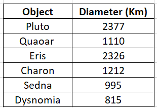
- Tables: On the SAT, tables refers to a structured arrangement of data organized in rows and columns. It is a visual representation that presents information in a concise and organized manner, making it easier to analyze and interpret data relationships. Tables often contain headings or labels for the rows and columns, allowing for quick reference and comprehension of the information presented. They are commonly used to display numerical data, comparisons, and relationships between variables, providing a clear snapshot of the data set for analysis and inference. Here’s an example of a table:
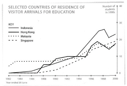
- Line graphs: A line graph is a type of visual representation that displays data points connected by lines. It is used to illustrate the relationship between two variables over a continuous range. The horizontal axis represents the independent variable, typically denoting time or another continuous measure, while the vertical axis represents the dependent variable. The line graph allows for the visualization of trends, patterns, and changes in the data over the given range. By examining the slope, peaks, or valleys of the lines, one can draw insights about the relationship between the variables and make inferences based on the data presented. Line graphs are commonly used to depict data involving time series, growth rates, comparisons, or trends, providing a clear and concise visualization for analysis and interpretation.
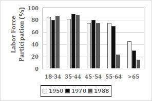
- Bar graphs: A bar graph is a visual representation that uses rectangular bars of varying lengths to compare different categories or groups. Each bar corresponds to a specific category or group, and the length of the bar represents the magnitude or frequency of the data being depicted. The horizontal axis displays the categories or groups, while the vertical axis represents the corresponding values or frequencies. Bar graphs are useful for displaying and comparing discrete data, such as survey results, populations, or categorical variables. They provide a clear and straightforward way to analyze patterns, trends, or relationships between different groups or categories within the data set. By examining the heights or lengths of the bars, one can easily identify and interpret differences, similarities, or changes among the categories or groups being compared.
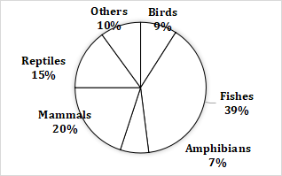
- Pie charts: A pie chart is a circular visual representation that divides a whole into different parts or categories, displaying the proportional relationship of each category to the total. The circle represents the whole, and each “slice” of the pie corresponds to a specific category. The size of each slice is proportional to the percentage or fraction it represents in relation to the whole. Pie charts are commonly used to display categorical or qualitative data, showcasing the distribution or composition of various elements within a dataset. They allow for a quick and intuitive understanding of how the different categories contribute to the overall picture. By examining the angles or areas of the slices, one can easily compare the relative sizes or proportions of the different categories and identify the dominant or minor components within the dataset. Pie charts are particularly useful for providing a visual summary of qualitative information and highlighting the relative significance of each category.